When my father died he left behind many things. His grieving family and friends, his unfinished projects and incomplete plans, sixty-three years of his accumulated life accoutrements, and any number of people and places changed in some way by knowing him. He also left his digital footprint - modest, by today’s standards, as Dad was a man from before the time of chronically online lives, but indisputably existent. Thousands of photographs lurking on harddrives, hundreds of files with his name in the authorship metadata, umpteen sent emails and outgoing phone calls. Entries in countless databases - a passport, a drivers licence, library cards, movement records, electoral rolls, census entries, bank accounts, customer loyalty programs, on and on it goes. Digital traces of my father left on systems and servers scattered around the globe.
One of the last of these traces was Dad’s death record which, in time, became an anonymised observation in the Australian National Mortality Database and the Australian Cancer Database. My father’s death became one datapoint subsumed amongst millions of others to form a measurement of how Australians die. Our collective loss is quantified, cleaned, and structured. Our loved ones are anonymised into a handful of attributes, then aggregated into totals and proportions, redrawn as lines and bars. The distance afforded by this transformation allows for a refocus, a shift in perspective that allows a different view to emerge.

When distilled and neatly ordered these death records form a bigger picture, allowing us to see changes in their landscape. With advances in early detection and treatment, over the last few decades Australia has seen a steady and substantial decline in the proportion of people who die of cancer within five years of their diagnosis.
This is a hopeful story. But it is not the only story these datapoints can tell us.

If we focus in just on the numerator, we see that the number of Australians who die from cancer consistently increases every year. The reality of our growing and ageing population is that while cancer is now more survivable, more people are dying of cancer. In 2009, when my father died of cancer, so did 41,000 other Australians. Last year, it killed 10,000 more than that.
 = 1,000 people
Faceting the data can tell us yet more stories. Age is among the handful of attributes remaining to our anonymised data points, and adding this to our view tells us that the vast majority of Australians killed by cancer are older people. This added information provides more context to situate ourselves in the story. Who you see in this data depends on where you stand.
Even as these pictogram proxies try to make it easier to see the people behind the number, an attempt to focus our gaze on them renders this number unfathomable. What is 51,000 people? Half the MCG? The entire town of Port Macquarie? 1,000 buses? The search for a comprehensible comparator leaves us flailing in our own context. To understand, perhaps we need to hear a smaller story.
A single day becomes a little easier to understand. We can spend a moment with each of these datapoints, see each death as a single event. Compressed into just a few minutes and stripped of identity, 140 deaths are made more visible. Yet 140 people are still more than we can hold in our mind. Do we need to go smaller again?
Margot, 92
Colorectal cancer
James, 87
Lung cancer
Patrick, 91
Prostate cancer
Judith, 62
Breast cancer
David, 49
Pancreatic cancer
Maria, 73
Lung cancer
An hour is easier again to comprehend. In an hour, you can take a walk, listen to an album, or cook and eat a meal. Imagine sitting at a dinner table with six other people. It’s easy enough to learn the names and faces of six people sitting around a table, to learn a little about them.
The big picture is gone, but we start to see something else.
Gordon Anderson, 63
Cancer of unknown primary site
This story is not intended to be an obituary, so I will just say that my father was someone special, who left an irreparable Dad shaped hole in my life. The small black dot of his death, that single datapoint, is a marker of both his life and my loss, but it tells you essentially nothing about either.
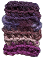
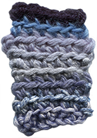
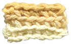
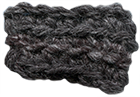
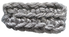
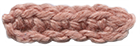
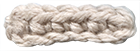
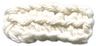
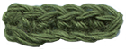
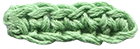
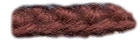
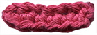
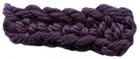
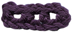
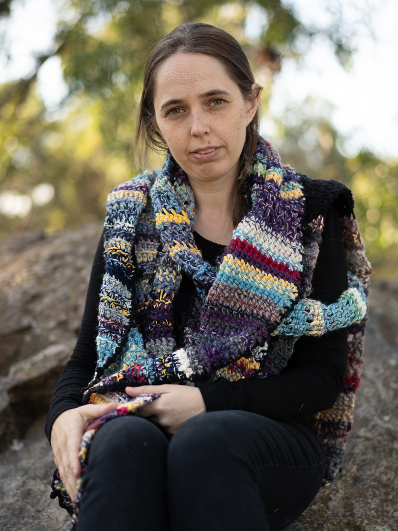
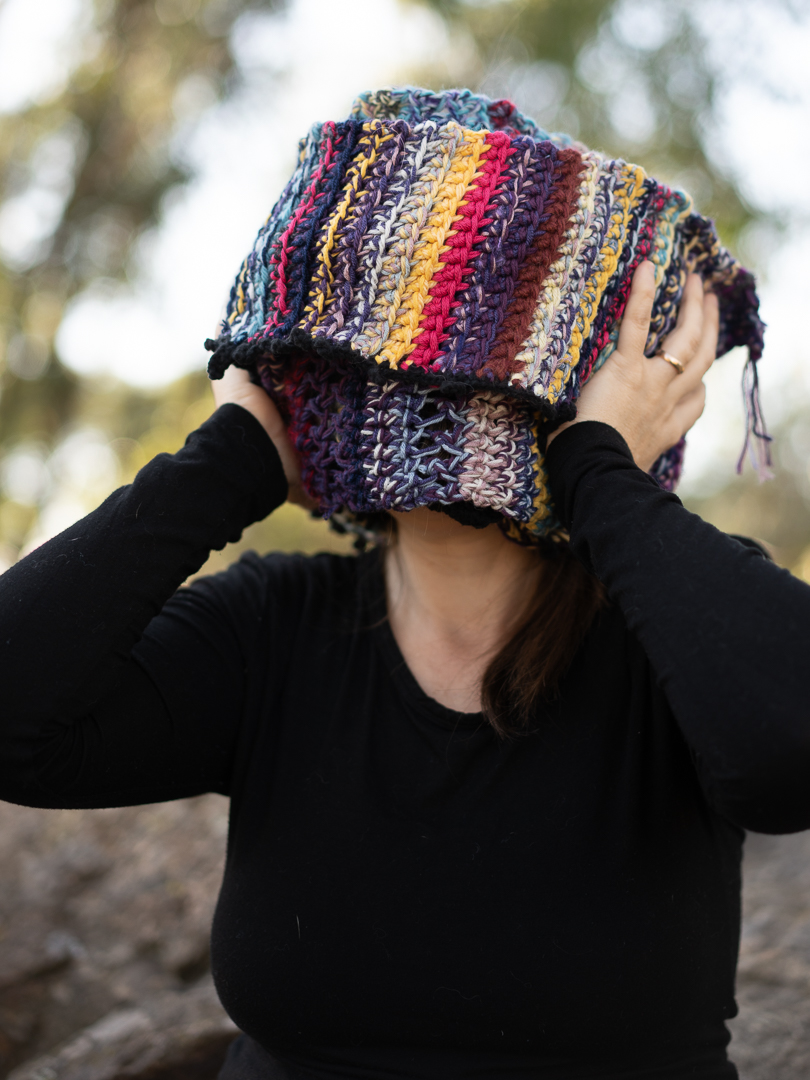
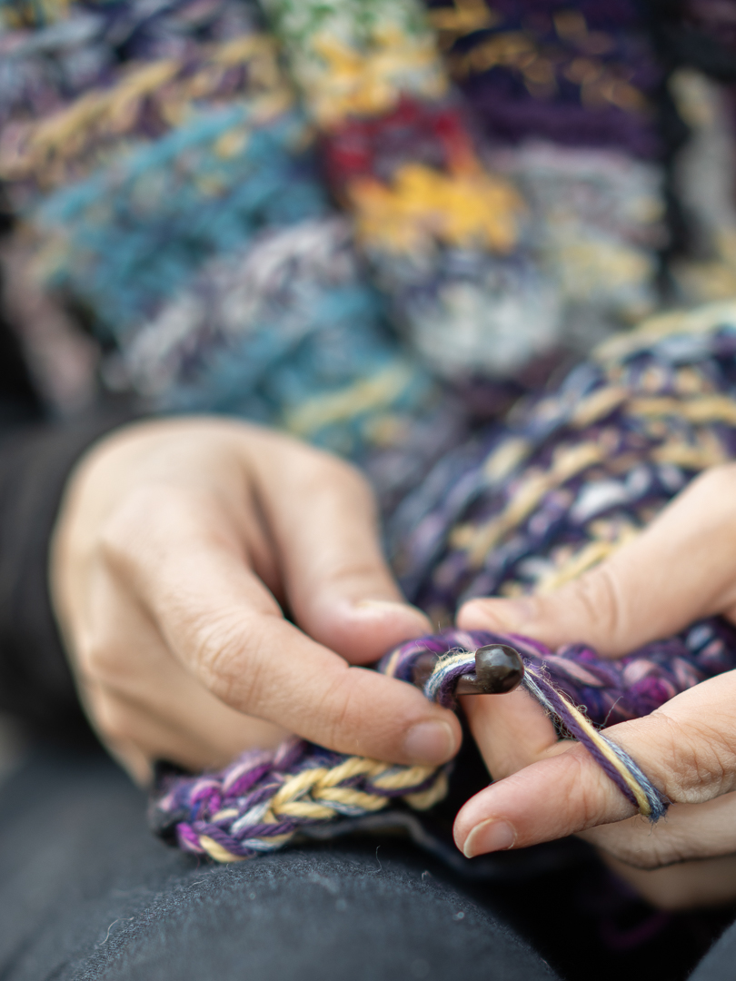
This year, I charted the story of this loss, materialising fifteen years of my grief in yarn. My tangled emotions categorised and colour-coded, my memories crocheted into crooked rows.
I remember…